
I've always had problems with colours, they baffle me and scare me because i don't understand them in the slightest. I still don't understand them fully, only a master can say that they do; but right now i feel a bit of clarity about them and how to use them more successfully than before. I even find myself noticing things i didn't before in other paintings and how they have applied the things i have learned in their masterworks. Now i must warn anyone reading this that i may not be the best at explaining things so if you have any questions just comment below or message me and i'll try to answer them to the best of my understanding.
SO! This my friends, is the Fletcher wheel.

I have found out a few things about it but the best one can be found on the concept art forum thread where it is taken from the book itself explaining it all. I haven't been able to read it all yet as it is seriously OP to the max but everything i'm writing is pretty basic stuff that I've been able to understand from it and from someone else explaining it all to me in layman's terms (Thanks Mitch!).
So i guess the best way to start is explaining the wheel, its a basic colour wheel made up of the primary and secondary colours. (top middle clockwise) Yellow, yellow green, blue green, blue, blue violet, violet, red violet, red, red orange, orange and yellow orange.
The primary colours are yellow, blue and red. The secondary colours are green, violet and orange. When describing colours the primary should always be named first (i heard this is another colour theory lecture, smart tips!)
In the middle of the circle is essentially your colour picker. If you think of the outer edges as the height of saturation then the middle of the picker is grey, this mimics the colour picker in photoshop (so try to think of them as the same). The largest triangle is what i use for hue variations and triad complements of colour (but the triangle is not a perfect triangle so programs like kuler do not mimic this correctly). To understand the Fletcher wheel a bit easier i have primarily used my colour spheres (as you will see later) so i suggest anyone to try to make some to ease the pressure of applying the techniques to full on paintings. Anyways; back to the shapes within the wheel. I have made a small diagram to break it a part a little that explains it better than i could write.

So the whole point of the wheel is to help the artist find compliments that work in harmony with each other. Simpler right?

Here is a digital version i have made of fletchers wheel; i took some advice to add saturation of colour to it as well so that i could pick from it so i could see them in the colour palette in photoshop. Its been such a leap to see it from some letters to colour and i think it really helps to see it in this light as you find it a bit easier to understand.
I have also been told that you shouldn't be going any higher than the circle i have marked on the colour picker (bottom right) as it becomes to sickly and over saturated; And then i finally added the 10 steps of tone to the right to top it all off.
I have also been told that you shouldn't be going any higher than the circle i have marked on the colour picker (bottom right) as it becomes to sickly and over saturated; And then i finally added the 10 steps of tone to the right to top it all off.
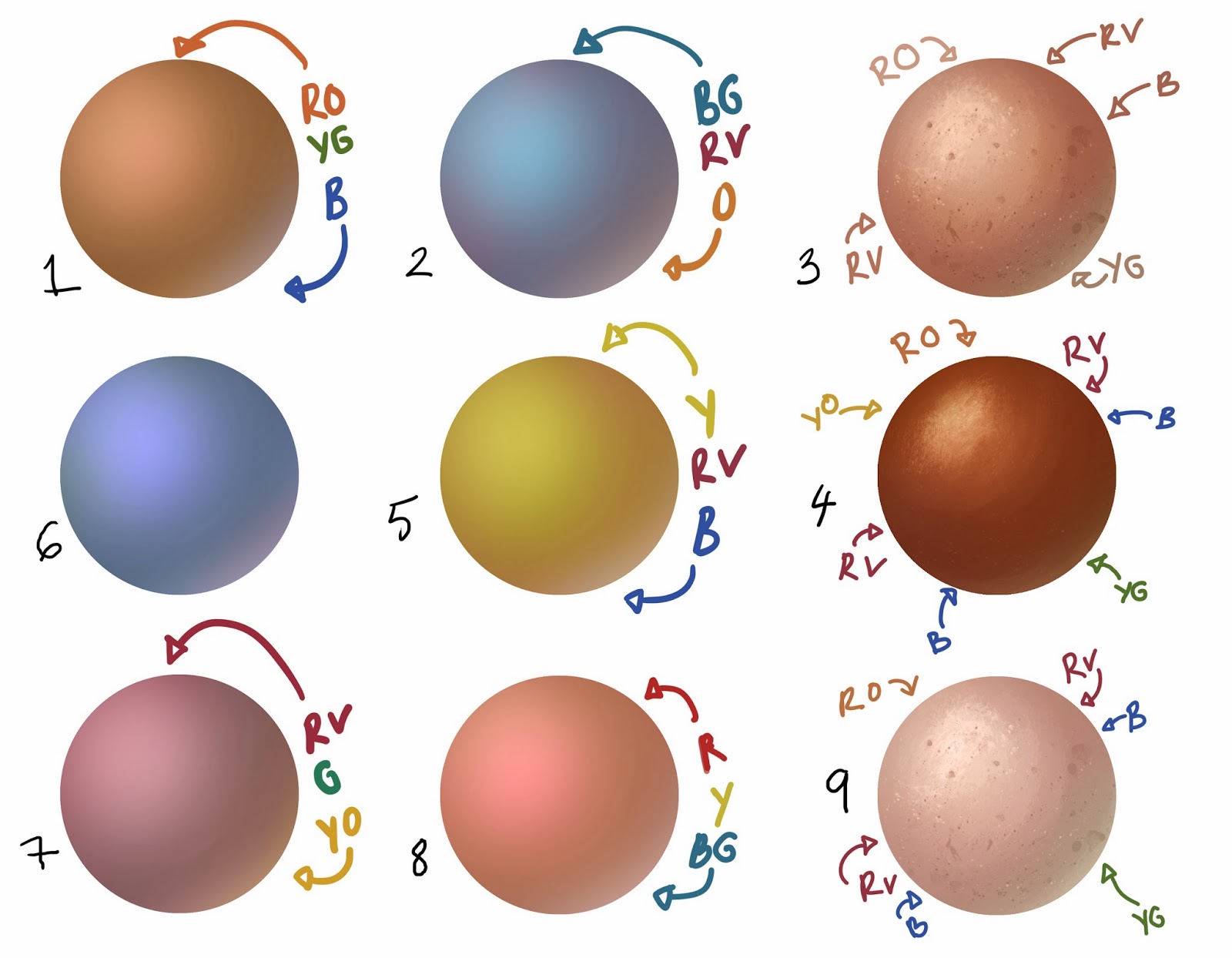
So how do i use this wheel? Basically you spin the wheel and use the white tip to pick your base colour, and then follow the the lines of the triangle clockwise to pick your three complimentary colours. As you can see in this simple sphere below:

The whole point of doing these subtle changes is to make the brain really think and absorb the painting more. The same reason why we use complicated compositions, its all to engage the brain and drag it into the picture. Its also helps to add natural depth to the painting, as you will see below with Erwin Madrid'd works. So i made some more spheres to show a few more combinations and then applied it to skin (on the far right) Skin uses the same principles as the spheres below and the colours in skin match the 4 complimentary colours in the wheel; cool huh?
So i've got to say, this blew my mind. And hopefully with this little bit i have been able to tell you, you'll start recognising it everywhere. So finally some examples!
The most obvious example i was shown to open my eyes was Erwin Madrid who has worked on a lot of dreamworks concept art.

You can see it so clearly, red orange and red violet. Red to Blue violet and if you check out his stuff you can see he utilises it constantly and it really brings some real depth to his work. You can find his work here.
And then there is a more classical painter like Waterhouse where you can't notice it as clearly straight away, but its still there. He limits his palette, uses saturated colours together but with great contrast against each other to create these amazing pieces.
 |
| Are you starting to notice it yet? |

After picking his colours apart with help from the colour wheel i was able to do a quick colour overlay of his painting.


First i identified the core colour that the scene is using, to me it feels like its the red orange which is used in the grass and the characters skin. I then put my key colour in my wheel at red orange and not to my surprise it all followed suit to the colours that Waterhouse were using in harmony together. Tearing apart stuff like this has really helped me to understand the deeper meaning to colour and the exciting thing it that there is so much more to learn!
Like i have said before, i have a basic understanding and there is so much more to it to discover and i hope I've helped a few more understand it a little better too.
My final advice is that if you are interested in this theory, make your own fletcher wheel. I truly feel that if you were to make your own you will understand the wheel fully! Its really easy and if you use Fletchers as the basis then it really pushes you forward. ~ Thankyou :)